Designing a new logo

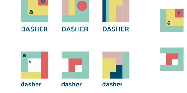
Colours and Inspiration for a Dasher logo for 2020
Designs: Fig/Ace Centre 2020
Whilst the hard work of language models and toolchains and whatnot are worked on by some very clever people there are some jobs that seem a lot easier - but possibly may cause a lot of contention!
The original dasher looked like this:

Original logo - remade by the Ace Centre for the iOS release.
Designs: Fig/Ace Centre 2020
Here at the Ace Centre - we had to recreate this logo with vectors for the release of the updated iOS build (we didnt do much - largely just got it working)
But going forward we felt we needed to update this to differentiate this completely new build and make it a bit “fresher”.
The above designs were some suggestions. In the end we have plumped for the logo we are using. But do get in touch if you can do better or have any feelings. We’d love to hear from you!