1. Introduction
Dasher Manual
David J.C. MacKay
January 25, 2006 — Draft 1.
The first part of this manual assumes you are steering Dasher with a mouse, in
order to write in English. Dasher also works in over a hundred other languages.
Please see the Dasher Special Needs Guide for information about alternatives to
mouse-steering.
1 Dasher
Dasher is an information-efficient text-entry interface, driven by natural continuous pointing gestures. Dasher is a competitive text-entry system wherever a full-size keyboard cannot be used - for example,
- on a palmtop computer;
- on a wearable computer;
- when operating a computer one-handed, by joystick, touchscreen, trackball, or mouse;
- when operating a computer with zero hands (i.e., by head-mouse or by eyetracker).
The eyetracking version of Dasher allows an experienced user to write text as fast as normal handwriting - 29 words per minute; using a mouse, experienced users can write at 39 words per minute.
Dasher can be used to write efficiently in any language. Dasher is fast and fun to learn. (See what users round the world say, in section 8.) Dasher is free software. It’s distributed under the same license as GNU/Linux, the GPL.
1.1 How does Dasher work?
Dasher is like an arcade game: ‘Attack of the killer alphabets’, perhaps.
Financial Times, 5th February 2002
Dasher is a zooming interface. You point where you want to go, and the display zooms in wherever you point. The world into which you are zooming is painted with letters, so that any point you zoom in on corresponds to a piece of text. The more you zoom in, the longer the piece of text you have written. You choose what you write by choosing where to zoom. To make the interface efficient, we use the predictions of a language model to determine how much of the world is devoted to each piece of text. Probable pieces of text are given more space, so they are quick and easy to select. Improbable pieces of text (for example, text with spelling mistakes) are given less space, so they are harder to write. The language model learns all the time: if you use a novel word once, it is easier to write next time.
1
A big advantage of Dasher over other predictive text-entry interfaces that offer word-completions to the user is that it is mode-free: the user does not need to switch from a writing mode to an “accept-model-predictions” mode. Another advantage is that it is easy to train the model on any writing style: simply load up an example file, then write away! It’s quite hard to convey in words what Dasher looks like, so please visit www.dasher.org.uk to see movies.
1.2 Dasher explained – the library analogy
Imagine a library containing all possible books, ordered alphabetically on a single shelf. Books in which the first letter is “a” are at the left hand side.Books in which the first letter is “z” are at the right. In picture (i) below, the shelf is shown vertically with “left” (a) at the top and “right” (z) at the bottom. The first book in the “a” section reads “aaaaaaaaaaaa…”; somewhere to its right are books that start “all good things must come to an end… ”; a tiny bit further to the right are books that start “all good things must come to an enema… ”. When someone writes a piece of text, their choice of the text string can be viewed as a choice of a book from this library of all books - the book that contains exactly the chosen text. How do they choose that book? Let’s imagine they want to write “all good things… ”
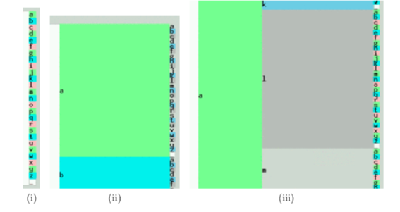
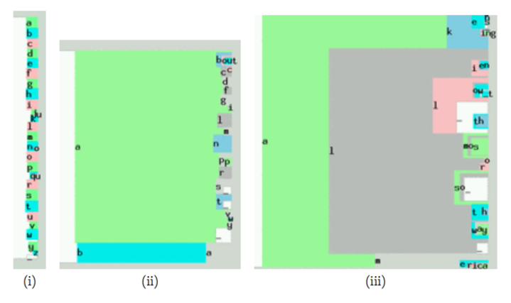
First, they walk into the “a” section of the library. There, they are confronted by books starting “aa”, “ab”, “ac”, . . . “az” [Picture (ii)]. Looking more closely at the “al” section, they can find books starting “ala”, “alb”, . . . “alz” [Picture (iii)]. By looking ever more closely at the shelf, the writer can find the book containing the text he wishes to write. Thus writing can be described as zooming in on an alphabetical library, steering as you go. This is exactly how Dasher works, except for one crucial point: we alter the SIZE of the shelf space devoted to each book in proportion to the probability of the corresponding text. For example, not very many books start with an “x”, so we devote less space to “x. . . ” books, and more to the more plausible books, thus making it easier to find books that contain probable text. Here is the corresponding sequence of pictures of the library in Dasher. (The character ” ” denotes the space character.)
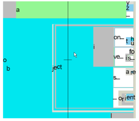
Dasher can be trained on examples of any writing style, and it learns all the time, picking up your personal turns of phrase. The image below shows the state of the Dasher interface while the user is writing the word ‘objection’; alternative words that could easily be written at this point include ‘objective’, ‘objects ’, and ‘object oriented’.
If you find Dasher hard to imagine based on these static pictures, please take a look at the movies on www.dasher.org.uk.
1.3 Tips for novices
Don’t give up if it takes you a minute or two to get started - within ten minutes, you’ll be blazing along. It’s a lot like driving a car. You should start by driving cautiously. If you can’t tell where you are going, stop going. Indeed, you will probably learn Dasher fastest if you come to it with car-driving analogies in mind, rather than standard computer analogies. For example, the way navigation works is not by DRAGGING but by STEERING: if cars worked
like windows computers, you would have to “grab” the piece of road you want, then “drag” it towards you; but in a car, when you wish to drive right, you POINT RIGHT with your steering wheel. Dasher does not work by dragging either. Do not try to grab things and drag them. Just decide where you want to go, and point there. The single most important concept that a novice user needs to understand is that one should always continue inside the text written so far: to select the book that contains “all” as its first word, one does not enter the “a” section of the library, then exit the “a” section, and enter the “l” section. One enters the “a” section, then finds the “al” section that is within the “a” section, then enters the “all” section within the “al” section. It’s just like finding a name in a phonebook. To find “Alison”, you don’t go to the “A” section of the phonebook, then the “L” section: you go into the “A” section, then find within it the “Al” section, and so forth. Once you are in the “Al” section, you never leave it. The second most important idea is that what you have written depends only on where you finally end up in the library, not on how you got there; so there is no need to steer accurately on your way to your destination. You are allowed to cut corners. (For example, in the previous image, if you wanted to write ‘objects are’, it would be fine to move the mouse straight towards the letters ‘are’, even if this takes the mouse across the unwanted grey ‘i’ square.) Common errors. Often, a beginner who is trying to find a particular letter will drive the display forwards fast while hunting for the letter. The rule of the road for Dasher users is just like that for car-drivers: don’t drive forwards until you have identified where you want to go! So, after you have found the first letter of your sentence, and zoomed towards it, please SLOW DOWN and don’t proceed any further into this first letter’s square until you have figured out where you should be steering towards. Your next letter is there, immediately inside the first square you have entered. The letters are ordered alphabetically. If you can’t see your letter, figure out where it must be on the basis of the letters you can see. Then point to the right place and enter the second letter’s square.
1.4 Example
Imagine you want to write ‘I once had a whim’. You write ‘I once ha…’ and the Dasher display looks like figure 1. You want to write ‘had’. What should you do? There are lots of letter ds on the screen, and all of them are rather small. The five arrows in figure 1 show some of these ds. The purple arrow points to a d that we can’t see yet, but we know it must be there because we can see ‘a’, ‘b’, and ‘c’ above it. A common beginner’s mistake is to keep rushing forward and spot any of these letter ds, and zoom into it. For example, figure 3 shows what happens if the user zooms towards the d highlighted in figure 2. If you go in this d, you are writing ‘I once head…’. The other two ds labelled by red arrows (in figure 1) correspond to writing ‘I once heard…’ and ‘I once hedge…’. It is crucial to understand that there is only one correct d, namely the d that is immediately inside the blue box corresponding to letter ‘a’ in the sequence ‘I once ha’. That blue box is highlighted in figure 4. If you ever leave that blue box (as we did in figure 3) then we lose the letter ‘a’.
1.5 Summary
Don’t click. Don’t drag. And don’t speed.
1.6 What do the colours mean?
In the English-language desktop version 3 of Dasher,
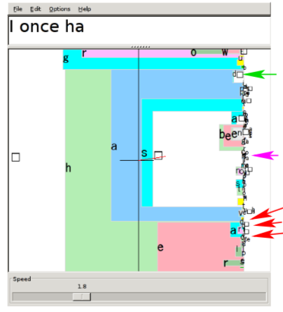
Figure 1: Writing ‘I once had a whim’. Where should the user steer now?
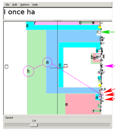
Figure 2: Some alternative letter ds, with a beginner’s error highlighted.
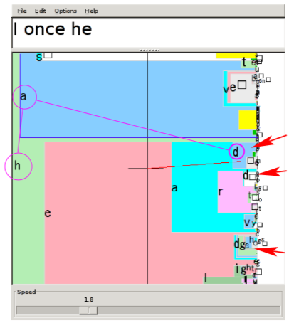
Figure 3: What happens when you select the wrong d.
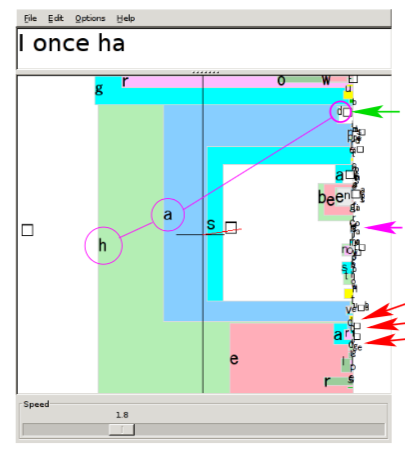
Figure 4: The correct letter d is the one marked by the green arrow. This example illustrates the rule “always keep going inside the box that you want” – in this case, the blue box associated with the letter a of the word ‘had’.
- white squares contain the space characters (always placed at the bottom of the alphabet);
- a special yellow box contains the upper case characters [A-Z];
- a red box contains numerals [0-9] (if the full alphabet is enabled);
- a green box contains punctuation characters (with the characters most similar to the space character [.,;:-] placed at the bottom, next to the white space character. Within the punctuation section, letters with similar roles are coloured similarly: punctuation characters similar to the period [.,;:-] are coloured slate-blue;
- the other colours are included simply to discriminate the squares from each other.
- In languages with accents (grave, acute, circumflex, etc), the accents are displayed in an orange box.
- In the Japanese version of Dasher, colours are used to distinguish the different hiragana groups (eg ka,ki,ku,ke,ko are orange).
- In the Korean version of Dasher, three different colours are used to distinguish initial consonants, vowels, and terminal consonants. You can alter the colour scheme by editing the colour and alphabet xml files, as described in section 3.
1.7 How to start dasher (version 3)
Set the dasher application running; when the dasher window comes up, either click the left mouse button or press the space bar to set it going. [One of these two will work.] Repeat this action (click or space), when you are finished, to stop dasher from dashing. Your computer’s mouse controls Dasher. Adjust the speed slider to fix the maximum speed Dasher will zoom at. A speed of 1 is good for a beginner, increasing to 2 after 5 minutes’ practice, and to 4 when you are expert.
1.8 How to start dasher (version 2) on pocket PC
Install, run (wait a few seconds for it to load up the training file), then touch the screen with the stylus to make dasher move. There are three special strongly-coloured squares in this version of Dasher, coloured yel- low, red (in some releases only), and green; all three squares do not produce any character; these squares indicate sub-groupings of the alphabet. (Uppercase Alphabet, Numerals (in some releases only), and Punctuation.)
Feedback
Was this page helpful?
Glad to hear it! Please tell us how we can improve.
Sorry to hear that. Please tell us how we can improve.